Definitions[]

Oxford Dictionaries: [1] "A particular design of type"
Merriam- Webster: [2] "a set of letters, numbers, etc., that are all in the same style and that are used in printing." "the face of printing type" "all type of a single design"
Tech Terms: [3] "A typeface is a set of characters of the same design. These characters include letters, numbers, punctuation marks, and symbols. Some popular typefaces include Arial, Helvetica, Times, and Verdana. While most computers come with a few dozen typefaces installed, there are thousands of typefaces available. Because they are vector-based (not bitmaps), typefaces can be scaled very large and still look sharp. The term "typeface" is often confused with "font," which is a specific size and style of a typeface. For example, Verdana is a typeface, while Verdana 10 pt bold is a font. It's a small difference, but is good to know."[4]

Typeface is a design for a set of symbols or letters. Common use typefaces are Times Roman, Helvetical, and Courier. Typeface is one aspect of a font. The major difference between font and typeface is that a font is usable while typeface is visually presented to a viewer. Font includes such characteristics as size (measured in points), weight (light, bold, medium), italics, and etc. For instance, Times Roman would be a typeface, which shows a basic design of the symbols. However, a font connotes a different concept. As 8 point Times Roman in bold weight is a different font than italicized Times Roman 12 point. Although they use the same type of typefaces, because font embodies a particular size and weight, they are different fonts. [5]
History[]
The history of typeface begins in the 1450s with Johannes Gutenberg, who is best known for his invention of mechanical movable type printing which started the printing revolution. Prior to this books needed to be scribed by hand, typically by monks, but this all changed once Gutenberg created the first typeface: Blackletter. Blackletter is a typeface that was modeled off of the writings of the scribes, and it is characterized by thick vertical lines and thin horizontal connectors. While this typeface was effective when transcribed by hand it looked very squished together and dense when printed. As a result, Nicolas Jenson of France created Roman Type in the 15th century as an alternative to Blackletter. Roman Type was inspired by the lettering found on ancient Roman buildings and consists of straight lines and natural curves, making them easy to read and highly legible. Over the centuries people have created their own typefaces, and typeface has became a form of art. Many unique typefaces inspire artists to create their own typefaces, and some even draw pictures simply using letters.

As Anne Francis Wysocki, the author of The Multiple Media of Texts, emphasizes the importance of typography by stating that “we have come to associate different kinds of texts- and different kinds of appropriateness- with different shapes of type on a page (and hence on a screen), page composers can arrange the shape of text to achieve different ends,” fonts create different products depending on how we employ them.
Ellen Lupton also defines typeface as “an essential resource employed by graphic designers, just as glass, stone, steel and other materials are employed by architects" in Thinking with Type (13). Lupton defines a typeface as the design of the letter-forms and a font as the delivery mechanism. “In digital systems, the typeface is the visual design, while the font is the software that allows you to install, access and output the design (81.)” Thus, it is possible to generate several font formats from a single typeface. These typefaces evolved over time. Typefaces known as “humanist” thrived in fifteenth century. The ones idealized human body gained popularity during Renaissance and the trend moved on to bold and unique monster fonts as mankind faced the rise of industrialization. The early twentieth century was heyday for the avant-garde artists who experimented with the forms and rejected the historical ones. Wim Crouwel, a Dutch designer, published a “new alphabet in response to 1967’s rise of electronic communication." After the era of letters for optimal display on a digital screen (see Digital Revolution in Design ), in the early 1990s, many designers came to seek for letters that are imperfect, scratched, bent, bruised, and polluted. Changes in letter forms reflect the characteristics of the time period and explained by the changes happened during the time period.
Examples[]
Most type can be divided into four categories and this classification system with examples use useful in identifying understanding the strenghths and weaknesses of type and the impact they can make in writing.
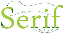
Serif Type:

Serif type have a decorative stroke at the end of characters that make individual letters distinctive therefore the human brain is able to understand it quicker and spends less time identifying the letter. Although the serifs are considered decorative they have a purpose, and aid in making letters more distinctive, for this reason serif type is very useful serif type is often used in printed witting with lengthy text such as newspapers and books.
San Serif Type:


San Serif type do not have the decorative end strokes. San Serif type is often most appropiate in online written works because of the simplicty of the type. The resolution of digital screen are much lower then printed works therfore the San Serif type is more legible.
Script Type:


Script Type are decorative type that have the appreance of handwritten lettering that can be often done with a tool such as a brush, pen, or pencil. Script type can come in various styles ranging from elegant and formal to organic and causal. Script type is commonly used when the piece of written works needs to be highly stylized and designed such as invitations, scrolls, diplomas and other forms of writing. Script type is not suitable for large bodies of text due to its complex characters, but are appropriate large headings and logo design. Script type should be used sparingly in a single form of writing and can become illegible if set in all capitals.


Decorative Type:
Decorative type can be somewhat similar to script type but it tends to much more stylized and eye-catching and some may even say "over the top." Decorative type serves to decorate and embellish text, thus making the written work more eye-catching and easier for the reader to perceive. Decorative should be used, but is no exclusive to, in informal writing that aims to be reader-friendly.
Resources and Further Reading[]
Bruce Willen and Nolen Strals. Lettering & Type: Creating Letters and Designing Typefaces. Princeton Architectural Press. New York. 2009.
This book contains a practical information about creating letters and type by giving sample guidelines for creating letters. This book was less rigid than others in terms of how to create letters, which suits more of the flexibility of how typeface can be and modified.
Alexander S. Lawson. Anatomy of a Typeface. David R. Godine publisher, 1990.
This book explores the letter forms, division, and classification as comprehensive study. The analysis consist of broad and representative range of international typefaces.
Phil Baines and Andrew Haslam. Type and Typography. Lawrence King Publishing. 2005.
This text goes through every aspect of typography, from history of language and writing systems to the invention of movable type and the evolution of the digital systems today. It serves as an overview of variety of typefaces available and its practical guide to using type as element of design.
Keywords[]
Citations[]
Lupton, Ellen. Thinking with Type: A Critical Guide for Designers, Writers, Editors, & Students. 2nd ed. New York: Princeton Architectural, 2004, 2010. Print.
Wysocki, Anne Francis. "Ch. 6: The Multiple Media of Texts: How Onscreen and Paper Texts Incorporate Words, Images, and Other Media." What Writing Does and How It Does It. Bazerman, Charles, and Paul Prior (eds.). Lawrence Erlbaum Associates, 2004. 123-163.